
Redesigning a Backoffice Tool for E-Commerce Operations
Redesigning a Backoffice Tool for E-Commerce Operations
Redesigning a Backoffice Tool for E-Commerce Operations
This project involved the redesign of a complex internal tool used for managing product listings, site navigation, sorting logic, and campaign visibility on an e-commerce platform. The purpose was to improve the daily workflow of operational teams by enhancing usability, reducing user errors, and supporting a more efficient setup process.
The work focused heavily on close collaboration with internal users, whose feedback was gathered through workshops and interviews. Their insights were crucial for identifying core pain points and informing design decisions. At the same time, the design work was closely aligned with backend developers to ensure feasibility within a system that was technically constrained and partially custom-built.
The updated solution aimed to improve clarity, shorten onboarding time, and minimize costly mistakes during setup and publishing.
Role
Role
I was responsible for the full design process — from discovery to handover. I conducted interviews with internal users, mapped key usability issues, and facilitated workshops to align around user needs and business priorities. Based on the insights, I redesigned the navigation UI and structure in close collaboration with the product manager and developers to reduce errors and improve efficiency in internal workflows.
I was responsible for the full design process — from discovery to handover. I conducted interviews with internal users, mapped key usability issues, and facilitated workshops to align around user needs and business priorities. Based on the insights, I redesigned the navigation UI and structure in close collaboration with the product manager and developers to reduce errors and improve efficiency in internal workflows.
Goal
Goal
The main goal was to improve the usability and clarity of the BooztPay experience across Boozt and Booztlet. By making invoices easier to understand and act on, we aimed to reduce customer service contacts, increase retention, and support revenue growth
The main goal was to improve the usability and clarity of the BooztPay experience across Boozt and Booztlet. By making invoices easier to understand and act on, we aimed to reduce customer service contacts, increase retention, and support revenue growth
Key problems
Key problems
Users were confused about where to find their invoices — especially when switching between Boozt and Booztlet
It was unclear what each invoice referred to, what needed to be paid, and when
Important actions like postponing or paying were not visually highlighted
Invoices were only sorted by date, with no filters or clear status indicators
Users couldn’t identify invoices by product or order, due to missing images or references
PDF downloads were hard to find, leading to unnecessary support tickets
The overall UI was outdated and lacked visual hierarchy and guidance
Role
UX Designer, responsible for user research, facilitation, design, and developer collaboration
Goal
Improve internal efficiency and reduce errors by redesigning the navigation setup flow, while migrating to a more maintainable codebase.
Key problems
The existing tool was originally developed without consistent UX principles or reusable design patterns, leading to a fragmented and unintuitive experience. Users had to navigate across disconnected views, lacked system feedback, and were often unsure whether tasks had been completed successfully.
This resulted in frequent publishing errors, high dependency on developer support, and long onboarding times for new employees. Over time, confidence in the tool declined, and its limitations became a bottleneck in daily operations — especially during high-paced campaign setups. Additionally, the legacy codebase introduced technical constraints that made improvements difficult without a full UX rethink.
Discovery
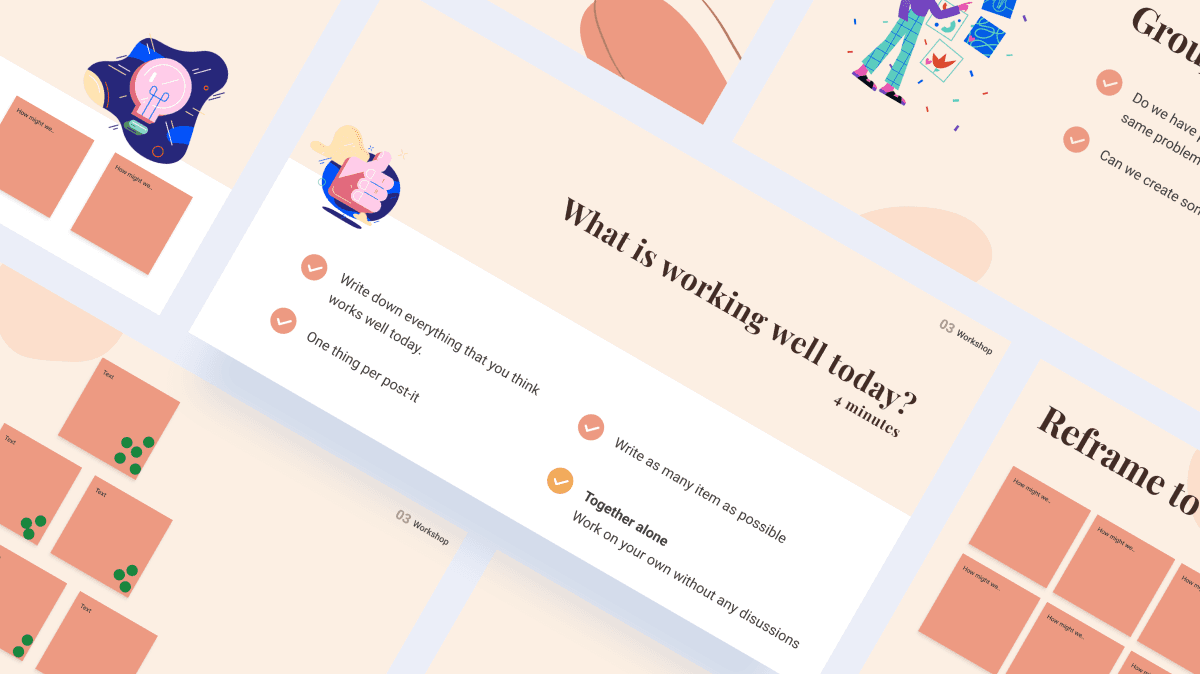

We started the project with a Lightning Decision Jam to quickly align on shared frustrations and opportunities across merchandising, campaign and operations teams. This helped us reframe assumptions into concrete challenges and prioritize them collaboratively.
After the workshop, I led a structured discovery phase that included:
8 user interviews with daily users of the tool — merchandisers, campaign managers, and site operators.
Workshop synthesis and prioritization to cluster key themes and define user needs.
Technical feasibility mapping through close collaboration with backend developers to understand architectural constraints.
Follow-up sessions with internal users to validate findings and refine our direction.
This collaborative and cross-functional approach gave us a solid understanding of both the usability pain points and the technical boundaries of the system.
Discovery
We started the project with a Lightning Decision Jam to quickly align on shared frustrations and opportunities across merchandising, campaign and operations teams. This helped us reframe assumptions into concrete challenges and prioritize them collaboratively.
After the workshop, I led a structured discovery phase that included:
8 user interviews with daily users of the tool — merchandisers, campaign managers, and site operators
Workshop synthesis and prioritization to cluster key themes and define user needs
Technical feasibility mapping through close collaboration with backend developers to understand architectural constraints
Follow-up sessions with internal users to validate findings and refine our direction
This collaborative and cross-functional approach gave us a solid understanding of both the usability pain points and the technical boundaries of the system.
Key insights
Users found the tool unintuitive and fragmented, often unsure where to configure what
Slow and fragmented UI: Switching between different setup steps was time-consuming and inefficient, especially when navigating between campaigns, sort order, and navigation settings.
Frequent publishing errors: The lack of feedback and confirmation led to mistakes in live content, requiring developer help to roll back changes.
Unclear structure and terminology: Many users struggled to understand where to configure specific parts of the listings. The system didn’t reflect their mental model or workflow.
Onboarding was difficult: New team members had a steep learning curve and often needed support to perform basic tasks in the tool.
Tight developer collaboration was essential: Technical limitations in the system architecture meant some ideas weren’t feasible. Early collaboration with backend devs helped shape realistic solutions.
Visual inconsistency caused confusion: The interface lacked consistent components or patterns, making it harder for users to predict how to interact with the tool.
Discovery
We started the project with a Lightning Decision Jam to quickly align on shared frustrations and opportunities across merchandising, campaign and operations teams. This helped us reframe assumptions into concrete challenges and prioritize them collaboratively.
After the workshop, I led a structured discovery phase that included:
8 user interviews with daily users of the tool — merchandisers, campaign managers, and site operators
Workshop synthesis and prioritization to cluster key themes and define user needs
Technical feasibility mapping through close collaboration with backend developers to understand architectural constraints
Follow-up sessions with internal users to validate findings and refine our direction
This collaborative and cross-functional approach gave us a solid understanding of both the usability pain points and the technical boundaries of the system.
Key insights
Users found the tool unintuitive and fragmented, often unsure where to configure what
Slow and fragmented UI: Switching between different setup steps was time-consuming and inefficient, especially when navigating between campaigns, sort order, and navigation settings.
Frequent publishing errors: The lack of feedback and confirmation led to mistakes in live content, requiring developer help to roll back changes.
Unclear structure and terminology:
Many users struggled to understand where to configure specific parts of the listings. The system didn’t reflect their mental model or workflow.Onboarding was difficult:
New team members had a steep learning curve and often needed support to perform basic tasks in the tool.Tight developer collaboration was essential: Technical limitations in the system architecture meant some ideas weren’t feasible. Early collaboration with backend devs helped shape realistic solutions.
Visual inconsistency caused confusion: The interface lacked consistent components or patterns, making it harder for users to predict how to interact with the tool.
Design process
Key insights
With a clear understanding of user pain points, the design phase aimed to reduce cognitive load, minimize user errors, and improve speed and clarity when working in the tool.
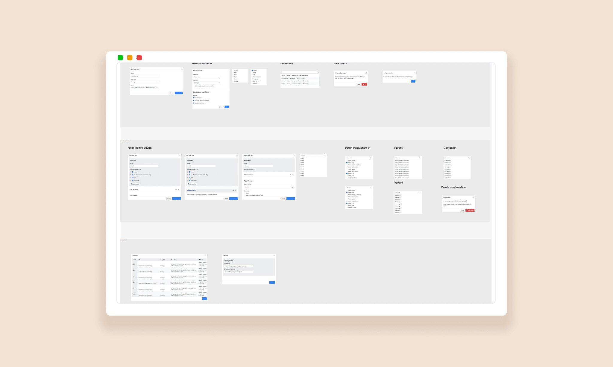
A major focus was redesigning the navigation tree, which had been one of the most frustrating parts of the old interface. Users struggled to find the correct pages due to unclear icons, a non-standard hierarchy, and a dense layout that made it easy to misclick — often resulting in costly delays. We restructured the tree for better hierarchy and spacing, updated the visual logic, and introduced clearer labels and feedback.
In parallel, we worked on modularizing the interface. The old tool lacked structure, so we introduced distinct modules for key configuration steps. These were designed with progressive disclosure, ensuring that only relevant settings were shown by default, while still allowing access to more advanced options when needed.
Key improvements included:
Modular layout – clearer separation between different setup steps
Progressive disclosure – surfaced advanced settings only when necessary
Visual feedback – tooltips, confirmations, and error prevention
Preview logic – enabling users to verify changes before publishing
Improved spacing and icons – reducing misclicks in complex tree structures
Throughout the process, we worked closely with the developers to align on feasibility and ensure smooth implementation.
With a clear understanding of user pain points, the design phase aimed to reduce cognitive load, minimize user errors, and improve speed and clarity when working in the tool.
A major focus was redesigning the navigation tree, which had been one of the most frustrating parts of the old interface. Users struggled to find the correct pages due to unclear icons, a non-standard hierarchy, and a dense layout that made it easy to misclick — often resulting in costly delays. We restructured the tree for better hierarchy and spacing, updated the visual logic, and introduced clearer labels and feedback.
In parallel, we worked on modularizing the interface. The old tool lacked structure, so we introduced distinct modules for key configuration steps. These were designed with progressive disclosure, ensuring that only relevant settings were shown by default, while still allowing access to more advanced options when needed.
Key improvements included:
Modular layout – clearer separation between different setup steps
Progressive disclosure – surfaced advanced settings only when necessary
Visual feedback – tooltips, confirmations, and error prevention
Preview logic – enabling users to verify changes before publishing
Improved spacing and icons – reducing misclicks in complex tree structures
Throughout the process, we worked closely with the developers to align on feasibility and ensure smooth implementation.
Users found the tool unintuitive and fragmented, often unsure where to configure what
Slow and fragmented UI: Switching between different setup steps was time-consuming and inefficient, especially when navigating between campaigns, sort order, and navigation settings.
Frequent publishing errors: The lack of feedback and confirmation led to mistakes in live content, requiring developer help to roll back changes.
Unclear structure and terminology:
Many users struggled to understand where to configure specific parts of the listings. The system didn’t reflect their mental model or workflow.Onboarding was difficult:
New team members had a steep learning curve and often needed support to perform basic tasks in the tool.Tight developer collaboration was essential: Technical limitations in the system architecture meant some ideas weren’t feasible. Early collaboration with backend devs helped shape realistic solutions.
Visual inconsistency caused confusion: The interface lacked consistent components or patterns, making it harder for users to predict how to interact with the tool.
Design process
With a clear understanding of user pain points, the design phase aimed to reduce cognitive load, minimize user errors, and improve speed and clarity when working in the tool.
A major focus was redesigning the navigation tree, which had been one of the most frustrating parts of the old interface. Users struggled to find the correct pages due to unclear icons, a non-standard hierarchy, and a dense layout that made it easy to misclick — often resulting in costly delays. We restructured the tree for better hierarchy and spacing, updated the visual logic, and introduced clearer labels and feedback.
In parallel, we worked on modularizing the interface. The old tool lacked structure, so we introduced distinct modules for key configuration steps. These were designed with progressive disclosure, ensuring that only relevant settings were shown by default, while still allowing access to more advanced options when needed.
Key improvements included:
Modular layout – clearer separation between different setup steps
Progressive disclosure – surfaced advanced settings only when necessary
Visual feedback – tooltips, confirmations, and error prevention
Preview logic – enabling users to verify changes before publishing
Improved spacing and icons – reducing misclicks in complex tree structures
Throughout the process, we worked closely with the developers to align on feasibility and ensure smooth implementation.

Outcome
& impact
Outcome & impact
Outcome & impact
The redesign introduced a more structured and intuitive interface that significantly improved how internal users configure product listings and navigation.
We developed interactive prototypes that were continuously tested with internal users throughout the process. These sessions revealed nuances in workflows and logic that were not fully captured during initial interviews — highlighting the value of ongoing dialogue. Their feedback led to several key iterations, particularly around navigation hierarchy, visibility settings, and publishing logic.
By launch, we delivered:
A new interface for navigation and listing setup
Redesigned navigation tree with clearer hierarchy and reduced error risk
Visual previews and step-by-step flows to guide publishing
Scalable patterns aligned with our new Bootstrap-based design system
The rollout is planned for 2025 and is expected to:
Reduce publishing errors and rollbacks
Shorten onboarding time for new users
Lower support demand from developers
