


Idre Fjäll
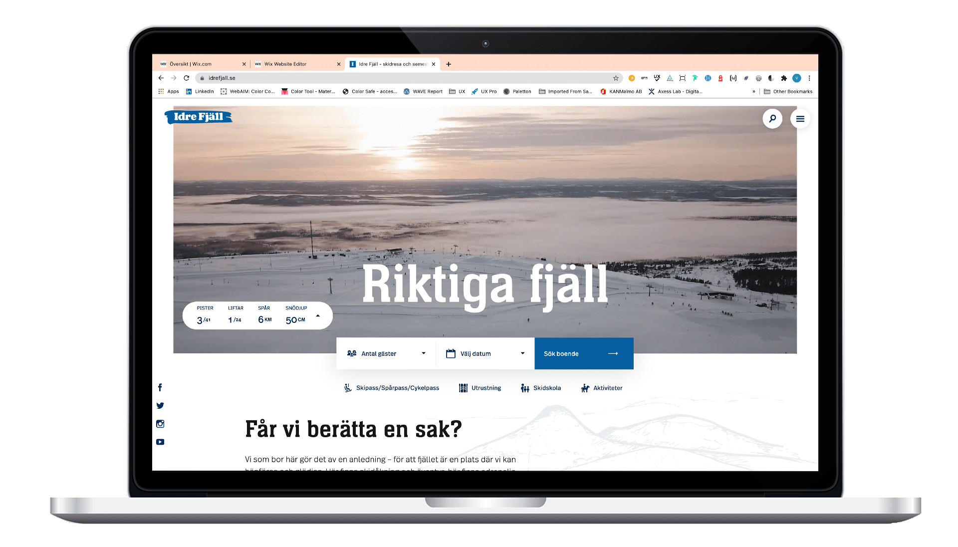
Idre Fjäll is one of Sweden’s ski/mountain resorts, known for its loyal guest base with many families returning year after year. Despite this, the website’s booking experience was outdated and struggled to support modern user behavior – especially on mobile.
To gain a deep understanding of the customer journey, we spent a full week on-site at the resort before the project began, conducting field research and interviews with both guests and staff.
A year later, when the new website launched, we returned to Idre once again, this time to gain insights that could guide future iterations. This allowed us to observe the experience in context and understand how the new flows were working in practice.
Role
Role
Role
UX-designer
UX-designer
UX-designer
Client
Client
Client
Idre Fjäll
Idre Fjäll
Idre Fjäll
Year
Year
Year
2019-2021
2019-2021
2019-2021
Goal
To redesign the booking experience with a mobile-first approach, supporting the full customer journey: before, during, and after the stay. We also aimed to make the site more accessible for first-time visitors, not just loyal returning guests.
Discovery
To fully understand the booking challenges at Idre Fjäll, we took a mixed-method approach combining qualitative research, quantitative data, and benchmarking. Spending a week on-site allowed us to gather insights from both guests and staff. We then complemented this with competitor analysis, surveys, and usability testing to identify recurring pain points across the entire customer journey.
Field research & interviews
We conducted 15 guest interviews at the resort, revealing that 12 of them booked their trips via phone, even though they had previously attempted to book online.
Key reasons:
Couldn't find preferred accommodations
Booking flow felt unclear and unreliable
Easier to just “call and get it done”
We also interviewed 10 staff members, uncovering recurring questions and support issues linked to missing or confusing information on the site.
Usability testing
To understand which parts of the current experience were breaking down, we conducted 10 usability tests on the live site– 5 on mobile, 5 on desktop. Participants were asked to complete typical booking tasks and narrate their thought process aloud.
Key findings:
Users had trouble navigating between accommodation types and add-ons (e.g. ski pass, rental, activities)
Mobile testers struggled significantly with filter logic, calendar UI, and CTA placement
Booking confirmations were vague and often didn’t reflect the user’s expectations
Trust in the system was low: participants weren’t sure if selections were saved or if bookings had gone through
These sessions helped us map specific usability breakdowns and informed design decisions early on.
Competitor analysis
As part of the discovery phase, we reviewed the digital booking experiences of key competitors such as SkiStar, Branäs, Kläppen, and Järvsö. The goal was to understand what users were already familiar with, and identify UX patterns, standards, and opportunities in the market.
While most competitors offered clear price visibility and relatively streamlined booking flows, we also noticed recurring issues such as inconsistent navigation across services and limited brand differentiation.
Overall, the benchmarking highlighted that:
Price transparency and fast decision-making were well supported.
Mobile responsiveness varied a lot, and many flows were not fully optimized.
There was an opportunity to differentiate Idre Fjäll with a more cohesive brand experience and a unified booking system across accommodation, ski rental, and activities
These findings helped shape the structure of our own design recommendations and gave us a realistic benchmark to work from.

Competitor analysis
Together with a colleague, I co-hosted a two-day design sprint with the team at Idre Fjäll. Due to time constraints, we ran a condensed version focusing primarily on day one of the classic sprint model, with an added strategy workshop on day two.
We used insights from our field research and user interviews as input for a round of expert interviews, followed by a "How Might We" workshop. Each participant synthesized findings into HMW-notes, which were then grouped and prioritized through voting.
This resulted in a clear definition of the project’s core challenges:
Address the entire customer journey: before, during, and after the trip
Make the booking process easier and more accessible on mobile
Reach new customer groups, not just returning visitors
We also defined a longer-term vision:
A booking experience that is fully responsive and works effortlessly on any device.
At the time, the existing site was not mobile-optimized, making this a key design driver from day one.

UX design & validation
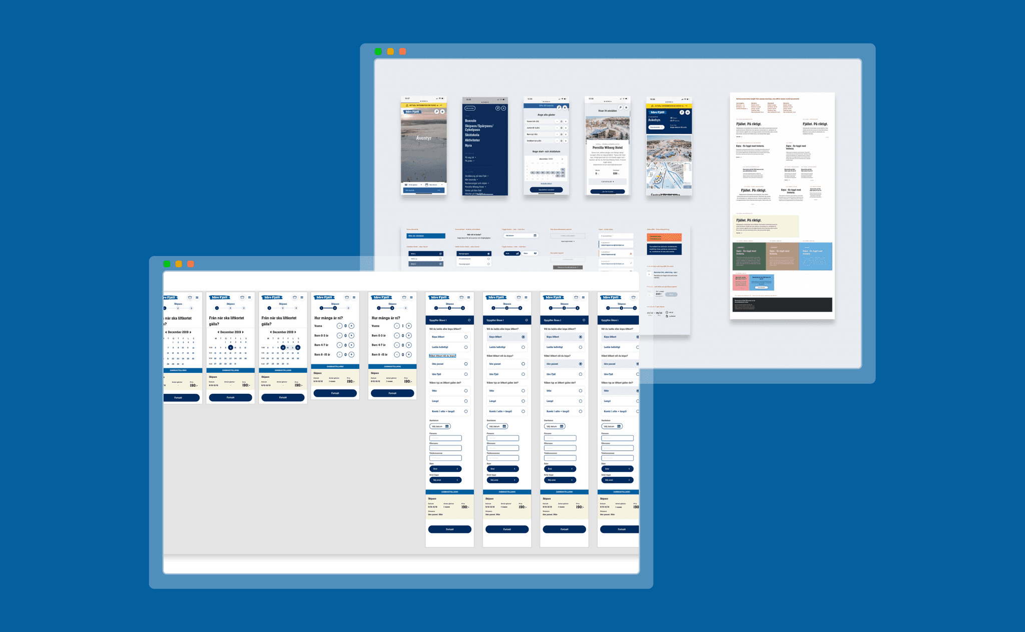
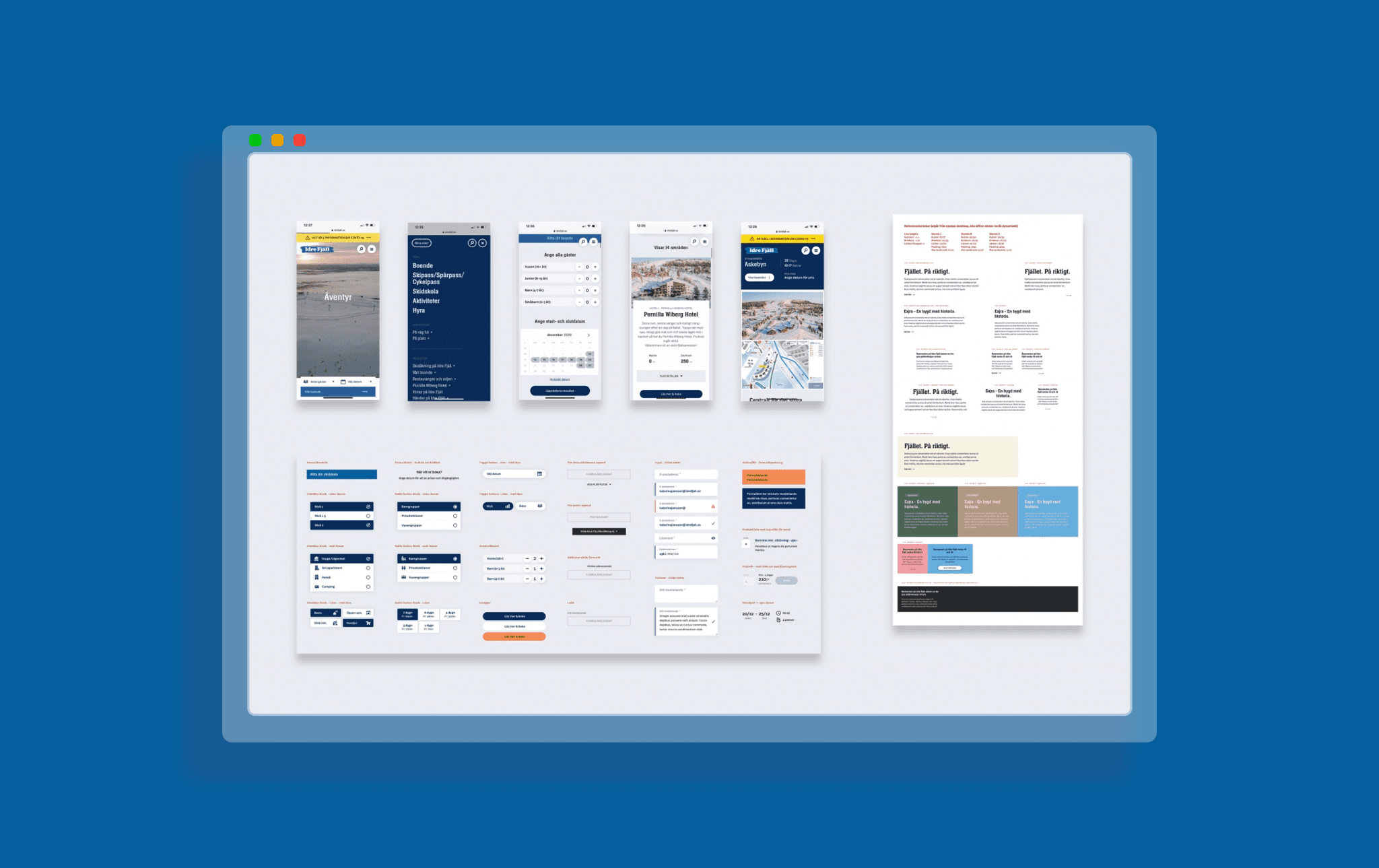
Following the design sprint, we moved into mapping out the booking experience in more detail. One of the key challenges was that Idre Fjäll offers multiple booking types — each with their own requirements, terminology, and edge cases.
I began by mapping user flows for the main booking categories:
Accommodation
Ski school
Ski rental
Skipass
Activities
A key focus was to identify shared logic and structure across all flows. By aligning modules and interaction patterns early, we ensured the booking process felt cohesive and consistent, regardless of product type.
Once the first version of wireframes was in place, we conducted usability testing on both mobile and desktop. These sessions helped validate the flow and highlight areas needing improvement — especially around filters, visual hierarchy, and clarity of CTAs.
I refined the designs based on the feedback and finalized the wireframes, which were then handed off to the art director for visual design and UI refinement.
After handing off the UX wireframes to the art director for visual design, the new booking experience was developed and launched.
Post-launch, we returned to Idre Fjäll to gather qualitative feedback on how the new design was experienced by real users. During this follow-up visit, we:
Conducted on-site usability testing
Reviewed ongoing guest surveys and user comments
Spoke with internal staff about recurring questions and support trends
These insights gave us valuable input for continued improvements and highlighted remaining friction points in the live environment.
Discovery
To fully understand the booking challenges at Idre Fjäll, we took a mixed-method approach combining qualitative research, quantitative data, and benchmarking. Spending a week on-site allowed us to gather insights from both guests and staff. We then complemented this with competitor analysis, surveys, and usability testing to identify recurring pain points across the entire customer journey.
Goal
To redesign the booking experience with a mobile-first approach, supporting the full customer journey: before, during, and after the stay. We also aimed to make the site more accessible for first-time visitors, not just loyal returning guests.
Field research & interview
We conducted 15 guest interviews at the resort, revealing that 12 of them booked their trips via phone, even though they had previously attempted to book online.
Key reasons:
Couldn't find preferred accommodations
Booking flow felt unclear and unreliable
Easier to just “call and get it done”
We also interviewed 10 staff members, uncovering recurring questions and support issues linked to missing or confusing information on the site.
Usability testing
To understand which parts of the current experience were breaking down, we conducted 10 usability tests on the live site– 5 on mobile, 5 on desktop. Participants were asked to complete typical booking tasks and narrate their thought process aloud.
Key findings:
Users had trouble navigating between accommodation types and add-ons (e.g. ski pass, rental, activities)
Mobile testers struggled significantly with filter logic, calendar UI, and CTA placement
Booking confirmations were vague and often didn’t reflect the user’s expectations
Trust in the system was low: participants weren’t sure if selections were saved or if bookings had gone through
These sessions helped us map specific usability breakdowns and informed design decisions early on.
UX design & validation
Following the design sprint, we moved into mapping out the booking experience in more detail. One of the key challenges was that Idre Fjäll offers multiple booking types — each with their own requirements, terminology, and edge cases.
I began by mapping user flows for the main booking categories:
Accommodation
Ski school
Ski rental
Skipass
Activities
A key focus was to identify shared logic and structure across all flows. By aligning modules and interaction patterns early, we ensured the booking process felt cohesive and consistent, regardless of product type.
Once the first version of wireframes was in place, we conducted usability testing on both mobile and desktop. These sessions helped validate the flow and highlight areas needing improvement — especially around filters, visual hierarchy, and clarity of CTAs.
I refined the designs based on the feedback and finalized the wireframes, which were then handed off to the art director for visual design and UI refinement.
After handing off the UX wireframes to the art director for visual design, the new booking experience was developed and launched.
Post-launch, we returned to Idre Fjäll to gather qualitative feedback on how the new design was experienced by real users. During this follow-up visit, we:
Conducted on-site usability testing
Reviewed ongoing guest surveys and user comments
Spoke with internal staff about recurring questions and support trends
These insights gave us valuable input for continued improvements and highlighted remaining friction points in the live environment.

Competitor analysis
As part of the discovery phase, we reviewed the digital booking experiences of key competitors such as SkiStar, Branäs, Kläppen, and Järvsö. The goal was to understand what users were already familiar with, and identify UX patterns, standards, and opportunities in the market.
While most competitors offered clear price visibility and relatively streamlined booking flows, we also noticed recurring issues such as inconsistent navigation across services and limited brand differentiation.
Overall, the benchmarking highlighted that:
Price transparency and fast decision-making were well supported.
Mobile responsiveness varied a lot, and many flows were not fully optimized.
There was an opportunity to differentiate Idre Fjäll with a more cohesive brand experience and a unified booking system across accommodation, ski rental, and activities
These findings helped shape the structure of our own design recommendations and gave us a realistic benchmark to work from.