
Booztpay
Booztpay
Booztpay
BooztPay is Boozt’s own invoice and credit solution, used by over 1.4 million customers. Despite the growing user base, feedback from both customers and internal teams highlighted recurring usability issues, especially around navigating between Boozt and Booztlet invoices, understanding what to pay and when, and identifying which order each invoice referred to.
The confusion led to a high volume of support tickets, making BooztPay one of the most common reasons for contacting customer service. This redesign aimed to improve clarity, reduce friction, and lower support volumes, while aligning with accessibility and business goals.

Role
Role
I was responsible for the full design process, from early analysis to final prototype. This included identifying key pain points using customer service data and NPS feedback, conducting competitor analysis, and mapping out usability issues. I translated insights into UI concepts and created a prototype along with a test script. User testing is planned but currently on hold due to shifting project priorities.
I was responsible for the full design process, from early analysis to final prototype. This included identifying key pain points using customer service data and NPS feedback, conducting competitor analysis, and mapping out usability issues. I translated insights into UI concepts and created a prototype along with a test script. User testing is planned but currently on hold due to shifting project priorities.
Goal
Goal
Improve internal efficiency and reduce errors by redesigning the navigation setup flow, while migrating to a more maintainable codebase.
Improve internal efficiency and reduce errors by redesigning the navigation setup flow, while migrating to a more maintainable codebase.
Key problems
Key problems
The existing tool was originally developed without consistent UX principles or reusable design patterns, leading to a fragmented and unintuitive experience. Users had to navigate across disconnected views, lacked system feedback, and were often unsure whether tasks had been completed successfully.
This resulted in frequent publishing errors, high dependency on developer support, and long onboarding times for new employees. Over time, confidence in the tool declined, and its limitations became a bottleneck in daily operations — especially during high-paced campaign setups. Additionally, the legacy codebase introduced technical constraints that made improvements difficult without a full UX rethink.
Role
UX Designer, responsible for user research, facilitation, design, and developer collaboration
Goal
Improve internal efficiency and reduce errors by redesigning the navigation setup flow, while migrating to a more maintainable codebase.
Key problems
The existing tool was originally developed without consistent UX principles or reusable design patterns, leading to a fragmented and unintuitive experience. Users had to navigate across disconnected views, lacked system feedback, and were often unsure whether tasks had been completed successfully.
This resulted in frequent publishing errors, high dependency on developer support, and long onboarding times for new employees. Over time, confidence in the tool declined, and its limitations became a bottleneck in daily operations — especially during high-paced campaign setups. Additionally, the legacy codebase introduced technical constraints that made improvements difficult without a full UX rethink.
Discovery & research
To better understand the challenges users were facing with BooztPay, we initiated a thorough discovery phase combining customer insights, behavioral data, and competitor analysis.
Methods & sources
Session recordings – helped us identify key friction points in the user journey
Heatmap analysis – gave us quantitative insight into where users clicked & scrolled
Customer service feedback – provided recurring themes from real customer complaints and questions
Competitor analysis – looked at Klarna, Walley and Qliro to benchmark core invoice features and navigation

Key Findings & Insights
Through a combination of user interviews, session recordings, heatmaps, and customer service feedback, we uncovered a number of recurring issues in the BooztPay experience — as well as the underlying reasons behind them.
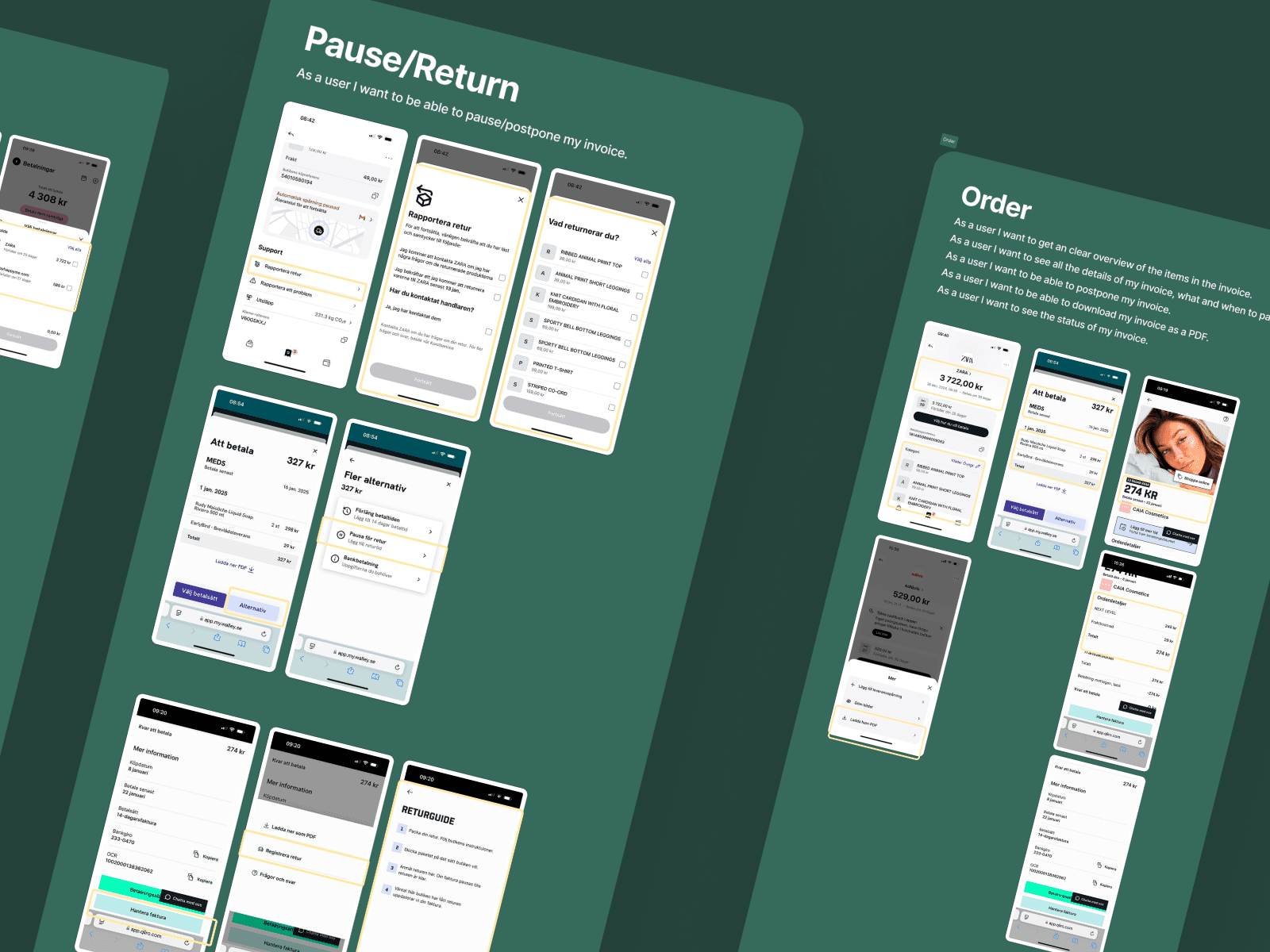
1. Lack of clarity and guidance
Users often felt lost in the interface. While they were able to find BooztPay, they struggled to understand what actions were expected of them. Invoices requiring action (e.g. overdue or unpaid) were not visually distinct, and there was no clear next step visible on the dashboard.
Insight:
The experience lacked visual hierarchy and action-driven navigation. Users needed a stronger “what–when–how” structure to confidently manage their payments.
2. Split expectations between Boozt and Booztlet
Users expected to see both Boozt and Booztlet invoices in one place, and were confused when they weren’t. This caused unnecessary back-and-forth and missed payments.
Insight:
Users viewed Boozt and Booztlet as one brand. Separating them in BooztPay conflicted with their mental model of a unified account experience.
3. Uncertainty around invoice content
Without product images or clear order references, many users didn’t know what a specific invoice referred to. Searching by order number was difficult, and customer service frequently received calls asking: “What am I paying for?”
Insight:
The lack of context and visual clues reduced trust in the interface and increased reliance on support.
4. Poor discoverability of key features
Users had a hard time finding the option to download their invoice as a PDF, and weren’t aware of account-based payment features like split payments or postponed invoices.
Insight:
Important functionality was hidden or missing from the entry-level views, making it harder for users to self-serve and complete tasks efficiently.
Discovery & research

To better understand the challenges users were facing with BooztPay, we initiated a thorough discovery phase combining customer insights, behavioral data, and competitor analysis.
Methods & sources
Session recordings – helped us identify key friction points in the user journey.
Heatmap analysis – gave us quantitative insight into where users clicked & scrolled.
Customer service feedback – provided recurring themes from real customer complaints and questions.
Competitor analysis – looked at Klarna, Walley and Qliro to benchmark core invoice features and navigation
Discovery & research
To better understand the challenges users were facing with BooztPay, we initiated a thorough discovery phase combining customer insights, behavioral data, and competitor analysis.
Methods & sources
Session recordings – helped us identify key friction points in the user journey.
Heatmap analysis – gave us quantitative insight into where users clicked & scrolled.
Customer service feedback – provided recurring themes from real customer complaints and questions.
Competitor analysis – looked at Klarna, Walley and Qliro to benchmark core invoice features and navigation
Key Findings & Insights
Through a combination of user interviews, session recordings, heatmaps, and customer service feedback, we uncovered a number of recurring issues in the BooztPay experience — as well as the underlying reasons behind them.
1. Lack of clarity and guidance
Users often felt lost in the interface. While they were able to find BooztPay, they struggled to understand what actions were expected of them. Invoices requiring action (e.g. overdue or unpaid) were not visually distinct, and there was no clear next step visible on the dashboard.
Insight:
The experience lacked visual hierarchy and action-driven navigation. Users needed a stronger “what–when–how” structure to confidently manage their payments.
2. Split expectations between Boozt and Booztlet
Users expected to see both Boozt and Booztlet invoices in one place, and were confused when they weren’t. This caused unnecessary back-and-forth and missed payments.
Insight:
Users viewed Boozt and Booztlet as one brand. Separating them in BooztPay conflicted with their mental model of a unified account experience.
3. Uncertainty around invoice content
Without product images or clear order references, many users didn’t know what a specific invoice referred to. Searching by order number was difficult, and customer service frequently received calls asking: “What am I paying for?”
Insight:
The lack of context and visual clues reduced trust in the interface and increased reliance on support.
4. Poor discoverability of key features
Users had a hard time finding the option to download their invoice as a PDF, and weren’t aware of account-based payment features like split payments or postponed invoices.
Insight:
Important functionality was hidden or missing from the entry-level views, making it harder for users to self-serve and complete tasks efficiently.
Design process
Based on the identified issues and research insights, our focus was to create a more guided and unified experience, where invoices from both Boozt and Booztlet could be accessed in one place, and where it would be immediately clear what actions, if any, the user needed to take.
The work was done iteratively in close collaboration with customer service, the payment team, developers and the product manager. Together, we defined key improvements that clarified navigation, added product and payment context, and surfaced the most important actions — helping users manage their invoices with more ease and confidence.
Key design improvements
Clearer navigation via MyBoozt
To improve findability, we added a direct “Invoices” entry point to the MyBoozt dashboard. This replaced the generic “BooztPay” link, using a term more familiar and meaningful to users.Unified invoice overview
Users can now see all their invoices — from both Boozt and Booztlet — in a single view, clearly separated by brand to reduce confusion.At-a-glance status clarity
Invoices now display status visually, helping users quickly understand what requires attention.Order context with product images
Each invoice includes product thumbnails, order number, and due date, so users can easily recognize which purchase it refers to.Actionable overview
Key actions like “Pay now” or “Postpone” are placed directly in the invoice cards, reducing friction and unnecessary steps.
Next steps
The redesigned BooztPay experience tackles several long-standing usability issues by clarifying navigation, surfacing invoice details, and providing a more intuitive structure for managing payments. However, due to a shift in business priorities, full implementation is still ahead.
Given the critical nature of this feature and the number of users affected, our next step is to validate the proposed improvements through user testing. A research script and interactive prototype have already been prepared, and we plan to conduct moderated interviews with BooztPay users to evaluate the clarity of the updated structure, the usefulness of added invoice context, and the overall ease of use.
The insights from this testing will help guide final adjustments and prioritization moving forward. Despite the pause in development, the project has created alignment across teams and a clear design foundation to improve retention, reduce customer service contacts, and deliver a more trustworthy post-purchase experience.